Posts

Silverlight 3 Multi-Touch with Windows 7 and HP Touch Smart.
Image
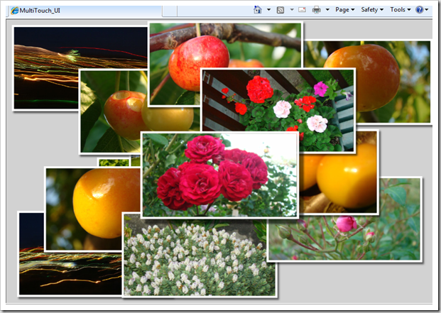
Inspired by the blog Silverlight 3 Multi-touch: The Basics by Tim Heuer , I thought of experimenting with it and creating a small sample. The logic is pretty simple, I have used TranslateTranform and ScaleTranform to do the movement and scaling respectively. When the TouchAction is Move we can distinguish whether it is a single touch or multi touch from the TouchPointCollection count. When it is a double touch you can calculate the change of distance between the two touch points and transform that as ScaleTransform of the Visual. Please watch the video, I shot on my office HP Touch smart machine. Have you got a multi-touch monitor?, then run the application here and feel the Silverlight touch. You can set your browser in Full-Screen mode to get a good experience. Please note that the current Silverlight version doesn't accept Touch inputs while running in Silverlight full screen mode(ie, App.Current.Host.Content.IsFullScreen =true). You can read more on Silverlight ...

Slider Preview as Expression Blend 3 Behavior

Behaviors is one of the new features Expression blend 3 has introduced to make interactivity easy. Behavior allows us to wrap the interaction logic as a very discrete unit and attach to any UI elements. My previous blog post about Attaching preview behavior to a Slider control , is a good scenario to make as a Behavior. I have used Attached Dependency property as a technique to make it happen in the earlier post, though the concept is almost same but Blend Behavior gives a neat and clean abstraction. It also allows a Blend user to just drag-drop to any Slider control. So this is a great functionality which helps boost the re-usability in a cool way. Problem : Create a behavior to display the value of a Slider control when hover over. First step is to make a class which derived from Behavior class. public class PreviewSliderBehaviour : Behavior<Slider> Here I am explicitly giving Slider class as my targeted UI Element type since this behavior is meaningless to other elements. ...

Attaching Preview behavior to a WPF Slider control

Image
Technorati Tags: MediaPlayer Style , Theme , WPF , XAML , ControlTemplate Today I am sharing about a common usage of Slider control for the Timeline scenarios as we can see in many Media players. The above pictures shows timeline/scrubber control of some popular video players( Hulu and Youtube ). We can edit the Slider Style and ControlTemplate to create the same look and feel of the above two scrubbers except the preview value get displayed when we hover over. While figuring out an easy way to build this, I got two different options. The first and the obvious solution is to extend the Slider class to create a new custom control, which will have a new DependancyProperty called PreviewValue to hold the mouse over value. The biggest challenge in this approach is to make this control as much flexible(design and dev friendly) because people may customize the control by giving different Size and Margins to the Track and other parts of the Control template, which will make our assumpti...

An easy way to update all the UI Property Bindings of an Instance at once! – Silverlight and WPF

Imagine that you have a lot of properties in a class and you are very sure that all of those properties are getting updated at the same point of time. What generally we do in the ViewModel scenario is that we create Property setters for all these and raise PropertyChanged event so as to get the data reflected in the UI layer bindings. But that is a real resource waste when you really know the time of all your property updates. The solution is really easy as per the MSDN documentation for PropertyChanged Event in the remarks section it says “ The PropertyChanged event can indicate all properties on the object have changed by using either a null reference (Nothing in Visual Basic) or String.Empty as the property name in the PropertyChangedEventArgs .” It seems that this is a great saver in terms of code writing and execution, since we need to raise only one PropertyChanged Event per class just after the property updation. Think about a Stock Trading scenario as an example to this, yo...

3D Flipper Control – Using Silverlight 3.0 Plane Projection

Image
Silverlight 3.0 has a coolest feature called PlaneProjection -a perspective transform which projects any UIElement on to a 3D plane. To create a plane projection you just need to set an attached property called ‘Projection’ on the UI Element. You can see relevant set of properties to rotate, center or offset. If you are using Expression blend 3 Beta , you can set these properties using the new Projection editor under Transform category of the property editor. I am going to create a 3D flipper control using this plane projection feature. I guess 3D flipping is the most popular and simplest 3D UX pattern out there. In a nut shell what we need is a custom Silverlight control which is able to take a ‘Front’ and ‘Back’ content elements. And the control should have the ability to flip both the contents in a 3D plane. For example if I have two images to flip, then my XAML should be as follows. So I need to define two dependency properties of type UIElement called FrontContent a...

Different ways to access XML data in Silverlight Application

Image
One of the most common requirement in the Silverlight development is to load XML data in to the application. I am going to describe a few different options that we can choose based on the situations. I am using LINQ for the XML parsing in the examples. Taking a sample XML file names Sample.xml with the following content < Employees > < Employee Name ="John" /> < Employee Name ="Mark" /> < Employee Name ="David" /> </ Employees > 1. Load XML file directly from the Web Server hosted Silverlight XAP You can host the XML file at your web server itself and Silverlight application can load it on demand. To simulate this in Visual Studio you need to create a Test Website for your Silverlight application and put xml file into the ClientBin folder. Now we can write few lines of code to read the XML. WebClient will download the file asynchronously void Page_Loaded( object sender, RoutedEventArgs e) { WebClient xmlClient = ...

Sunny Orange - WPF Theme 1

Image
Recently I found out that I have an old blog post about Control Templating a Button, getting a lot of hits. Many out there are looking for free control templates and themes for WPF/Silverlight applications. I am planning to publish few WPF/Silverlight themes in the coming posts. So here I am publishing a simple theme which has almost similar colors to the old blog post. It contains very basic set of controls.  1)Button 2)ToggleButton 3)ComboBox 4)TextBox 5)CheckBox 6)RadioButton 7)ScrollBar 8)ScrollViewer 9)ListBox 10)ProgressBar 11)Slider You can find the source XAML style here -   SunnyOrange_Theme.xaml WPF control theming and templating is very interesting and fun task in the WPF application development, it took only an hour or two for me to create this theme file. Please let me know your valuable feedbacks and suggestions .

A simple Multiselect ComboBox using expression Blend

Image
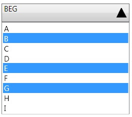
I have often seen requirements to have a combobox with multiple selection enabled. We know thatWPF ListBox control is having two special properties, which enables the multiple selection but the combobox doesnt have those public IList SelectedItems { get; } public SelectionMode SelectionMode { get; set; } There are many ways we can make a multiselect combo box 1)Create a custom control from the scratch and have a Listbox in the dropdown 2)Extend the combobox and add the above properties to it 3)Edit the Combobox control template to add necessary controls and binding. I am going to describe the 3rd idea from the above list, which is a total Expression Blend work, so no need of VS2008 to make a multiselect combobox from a simple combobox. Place a combobox in to the editing area and right click on the control to create an copy of the Control template. Now you can see the Control's tree on the left side of Expression Blend The ItemPresenter inside the scrollviewer is actually the...

Lilac Chaser - Optical illusion using Silverlight

Image
"When one stares at the center for about 20 seconds or so, one first sees a gap running around the circle of lilac disks, then a green disk running around the circle of lilac disks, then a green disk running around on the grey background, the lilac disks having disappeared or having been erased by the green disk. This is due to an interesting effect in which the colors of the lilac disks are inverted in the optical illusion to a green color" This optical illusion is called Lilac chaser  . Just thought of creating a silverlight version of this illusion for fun. I have used a radial panel( from my old blog ) to layout the ellipses radially, and implemented a a timer to change the visibility in a sequential way. This kind of effects can be a good candidate for Splash sreen for silverlight applications :) Full source can be found here 

Mix 10K Coding Challenge - Few Tips I have used to limit the code size

Image
While developing for the  MIX 10K coding challenge , the major challenge to face is to limit the code in 10K size. So I had to question each and every line of code that would it be possible to write this even with fewer bytes.  Check out my application at  http://2009.visitmix.com/MIXtify/TenKDisplay.aspx?SubmissionID=0044  Make sure to run the application in fullscreen mode.  Here I am compiling a list of tips and features I used to reduce the code size.  1.       Automatic Properties - Used this .NET feature to create the Tweet class which represents an RSS feed item from the search result    public class Tweet {   public string Guid { get;set; }   public string Title { get;set; }   public string Author { get;set;     … …. 2.       Object Initializers new Tweet {Title = element.Element("title").Value, Author = element.Element("author").Value, Guid = element.Element("guid").Value}}; 3.       LINQ to XML - I have used this to read the XML stream from...

Mix 10K smart coding challenge

Image
The Mix conference 2009 has organized a coding challenge on Silverlight/WPF with a restriction of using only 10Kb of source code. You can see the gallery of submissions at http://2009.visitmix.com/MIXtify/TenKGallery.aspx . Please visit and cast your vote for the entries you like, You can see my entry here. My application allows you to search the twitter feeds over the internet using Twitter Search APIs(basically same as what you can see at http://search.twitter.com/) What I am trying to acheive here with silverlight is just another way to visualize the search data along the time line travelling towards the negative Z-space . One more interesting feature I wanted to add to this in the future version would be to give the ability to navigate through the Z-space with mouse scroll to see the older results. This same kind of UX(user experience) can be used to view any sort of time based feeds like blog feeds or search results. Architecturally the application is utilizing the following maj...

Paginated ObservableCollection

Image
ObservableCollection class makes the collection binding very easy in Silverlight or WPF. This special collection is aware of the binding infrastructures and notify them whenever some changes happens to the collection. I have often come across the requirement to have  pagination enabled on collections. When we bind a Collection with many items inside to an ItemsControl, the visual will be created for each and every items. But as we can see that there is no big significance in displaying all the data with a huge vertical scroll bar(or similar mechanism) in it. So pagination is the typical user experience strategy we use in this kind of scenarios. Architecturally we can achieve the pagination mainly in three different ways Making the UI Control or Panel aware of the virtualization, so that the visuals wont create at the time of binding. But as an on demand visual element creation. VirtualizingPanel concept in WPF is actually helps to achieve this idea. For more details about WPF virtuali...

XAML Balloon Comments - Expression Blend Tip

Image
It is often a requirement in Silverlight and WPF that to create Balloon kind of UI for Toolip popups. It can be done in many ways. I am listing out few of the common Balloons you might be interested in.   < Grid             < Grid.RowDefinitions >                 < RowDefinition Height ="*"/>                 < RowDefinition Height ="30"/>             </ Grid.RowDefinitions >             < Rectangle RadiusX ="10" RadiusY ="10" Stroke ="#FF000000"/>             < Path Fill ="#FFFFFFFF" Stretch ="Fill" Stroke ="#FF000000" HorizontalAlignment ="Left" Margin ="30,-1.6,0,0" Width ="20" Grid.Row ="1"                 Data ="M22.166642,154.45381 L29.999666,187.66699 40.791059,154.54395"/>             < TextBlock HorizontalAlignment ="Center" V...

Interactive Silverlight Greeting Card

Image
For the last couple of days I was trying to make an animated e-card using Silverlight. So here is the final result. The speciality of this card is that when we move the mouse over the card we can see it as if it is a 3D object and get the perspective view of the objects(Papervision 3D?). All the Trees and Mountains are Path objects and the particles falling down are random sized ellipses. I have used Microsoft Expression Blend to do most of this work Click here to see the Card in action. The important part of this Silverlight appplication is a Custom Panel called  SpacialArrangePanel . This panel will arrange its children based on two Attached Dependancy Properties. 1) HangingPoint - A point determines its X and Y position in the space 2) ZDistance - A double value determines how far the object is in the Z-plane. There is another DependancyProperty in the Panel called CameraPoint, which has been hooked to the Mouse Move points so that the mouse pointer acts as an Eye/Camera view point ...

Concave cornered Rectangle - Expression Blend Tip

Image
An expression blend tip to create a Path looks like a concave cornered rectangle.  Put a Grid with 5*5 rows and columns. and add 4 ellipse and a rectangle as in the following XAML. < Grid x : Name ="grid" > < Grid.ColumnDefinitions > < ColumnDefinition Width ="0.1*"/> < ColumnDefinition Width ="0.1*"/> < ColumnDefinition Width ="0.6*"/> < ColumnDefinition Width ="0.1*"/> < ColumnDefinition Width ="0.1*"/> </ Grid.ColumnDefinitions > < Grid.RowDefinitions > < RowDefinition Height ="0.1*"/> < RowDefinition Height ="0.1*"/> < RowDefinition Height ="0.6*"/> < RowDefinition Height ="0.1*"/> < RowDefinition Height ="0.1*"/> </ Grid.RowDefinitions > < Rectangle Fill ="#FF000000" Grid.Column ="1...