Posts

WP7Dev Tip 2– Few things to remember on Image handling

Image
Image handling is an important factor deciding the performance as well as usability of any application. When it comes to Windows Phone 7 it is even more important because of the limited network conditions and the low processing power as compared to PC. Here is the video I am talking about the same things with a Bing Search sample in Silverlight TV show I am just listing down few common tips which can greatly improve the performance and effectiveness of your application. And also please note that some of the points might not be applicable for certain applications especially for very small apps. Use JPEG instead of PNG whenever possible – Jpeg decodes faster than PNG image.  If there is no transparency needed, use Jpeg with a compromised quality Optimize your static Image quality :  Medium quality compressed Jpeg requires less memory to render as compared to a full quality Jpeg. So there is a big savings in memory and performance, if we can compromise on the Jpeg quality slightly.

WP7Dev Tip 1– Optimizing the app by reusing already created visuals

Developing a good application in the phone need not be accompanied with so much of hacking around or doing lot of non-conventional tricks. Most of the time those tricks make us deviate from the regular ways of development, make the code ugly and unmaintainable.  If we can get a sense of the pain-points and limitations of the platform early, then find a way around it and separate those concerns out of your business logic so as to proceed with a smooth development. I am explaining a pretty basic yet useful idea of how to reuse the complex visuals you have already created in previous pages of the application at runtime. Please note that this may not be applicable to small applications involving two or three pages of total navigation. Problem : Imagine you have an application which needs to navigate to the same view over and over again. For example the Movie details page of IMDb or Netflix app, or profile page of Facebook or Twitter, those pages get called many times in the life span of

An easy Windows Phone 7 Photo Viewer using Pivot control #WP7 Tip

Image
Technorati Tags: WP7 , Windows Phone 7 , XAML , Pivot   Source Code Here is a small trick using the Pivot control for a Photo viewing experience. Imagine a Pivot control with out any header and the image as Pivot items. Yes it is that easy :). Since the Pivot supports for the Phone orientation you can enjoy the picture viewing both in Portrait and Landscape. I am giving step by step info if you are totally new to WP7 and XAML styling. And please note that the performance wont be that great if you have many images in the Pivot control. So you may need to do design that around or use some tricks to clean up the memory well. 1) Place a Pivot control and override the Style. What we wanted is to take out all the Header Templates and other extra puddings.         <Style x:Key="emptyPivot" TargetType="controls:Pivot">             <Setter Property="Template">                 <Setter.Value>                     <Co

UniformGrid for Silverlight

Image
Technorati Tags: Silverlight CustomPanel XAML UniformGrid WPF My recent Silverlight project had a need to distribute the items in rows and columns. I had to dynamically calculate the number of columns and rows it needed based on some logic. So it was clear that I need UniformGrid as in WPF so that I can bind my ViewModel properties to Rows and Columns properties of the Panel. But it was a bit surprising to me that there isn’t a Silverlight UniformGrid either in Silverlight SDK or in Silverlight ToolKit. So here is one I ported from WPF. Check out the Silverlight 3.0 demo below. You can also download the sample project

A Simple Accordion banner using ListBox

Image
This sample is to show how easily we can create an Image-accordion entirely in Expression Blend. This is utilizing the ListBox’s Selected and UnSelected VisualStates. Place a ListBox and override its ItemContainerStyle then adjust the width on the Selected and UnSelected visual states. When we override the ItemsPanel we can make it orientation to Horizontal on the StackPanel. Pretty easy and there is no C# needed. Paste the below XAML in your user control <UserControl.Resources> <ItemsPanelTemplate x:Key="ItemsPanelTemplate1"> <StackPanel Orientation="Horizontal"/> </ItemsPanelTemplate> <Style x:Key="ListBoxItemStyle1" TargetType="ListBoxItem"> <Setter Property="Template"> <Setter.Value> <ControlTemplate TargetType="ListBoxItem">

Button Style - Silverlight

Image
Really surprised to see from the google analytics that one of my old post regarding WPF control template still has many viewers . So I just thought of creating a Silverlight version of the same. All the buttons are from the same style with different Button.Background, the elliptical one has less height and more width on it. If you want to check out the XAML, please download from here

Silverlight 3 Multi-Touch with Windows 7 and HP Touch Smart.

Image
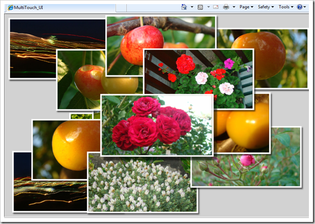
Inspired by the blog Silverlight 3 Multi-touch: The Basics by Tim Heuer , I thought of experimenting with it and creating a small sample. The logic is pretty simple, I have used TranslateTranform and ScaleTranform to do the movement and scaling respectively. When the TouchAction is Move we can distinguish whether it is a single touch or multi touch from the TouchPointCollection count. When it is a double touch you can calculate the change of distance between the two touch points and transform that as ScaleTransform of the Visual. Please watch the video, I shot on my office HP Touch smart machine. Have you got a multi-touch monitor?, then run the application here and feel the Silverlight touch. You can set your browser in Full-Screen mode to get a good experience. Please note that the current Silverlight version doesn't accept Touch inputs while running in Silverlight full screen mode(ie, App.Current.Host.Content.IsFullScreen =true). You can read more on Silverlight

Slider Preview as Expression Blend 3 Behavior

Behaviors is one of the new features Expression blend 3 has introduced to make interactivity easy. Behavior allows us to wrap the interaction logic as a very discrete unit and attach to any UI elements. My previous blog post about Attaching preview behavior to a Slider control , is a good scenario to make as a Behavior. I have used Attached Dependency property as a technique to make it happen in the earlier post, though the concept is almost same but Blend Behavior gives a neat and clean abstraction. It also allows a Blend user to just drag-drop to any Slider control. So this is a great functionality which helps boost the re-usability in a cool way. Problem : Create a behavior to display the value of a Slider control when hover over. First step is to make a class which derived from Behavior class. public class PreviewSliderBehaviour : Behavior<Slider> Here I am explicitly giving Slider class as my targeted UI Element type since this behavior is meaningless to other elements.